University Brand Refresh
[Campus update: 4/26/24]
Minnesota State University, Mankato’s brand refresh includes updated messaging and visual elements that align with the University's position as a top choice for prospective students.
The Minnesota State University, Mankato brand is supported by a messaging platform and a suite of visual expressions that includes logos, colors and fonts. Consistent use of those elements fosters a cohesive and recognizable identity for the University across all channels. It also helps establish trust and credibility with our key audiences.
This webpage introduces the new brand foundation and visual identity. More details about how to bring the brand life can be found in the new brand style guide COMING SOON!
Questions about the brand refresh or style guide should be directed to brand@mnsu.edu.
MEssaging platform
The University’s brand foundation serves as the unifying story that connects all audiences to a single compelling brand idea. It guides the creative expressions of the University and aligns all communications around the brand story. The foundation is comprised of the Brand Promise, the Brand Pillars and the Value Proposition.
Brand Promise:
Minnesota State Mankato is an inspiring, supportive, and opportunity-rich community that engages and empowers students with a relevant education that leads to success.
Brand Pillars:
Expert minds, personal touch • Resources for all to succeed • Welcoming all Mavericks • A smart investment • From Minnesota to the world
Value Proposition:
Personal and professional growth and success
Enhanced tagline: big ideas. real-world thinking. inspired action
Minnesota State Mankato is an opportunity-rich community where creative ideas become real-world solutions through action. Big ideas are the beginning. Real-world thinking gives meaning to those ideas. And Inspired action is the catalyst that brings them to life.
New Logos
The new suite of logos presents a bolder, more energetic look for Minnesota State University, Mankato. It includes a primary logo and wordmark, along with two new elements: an icon logo and an acronym logo. Both incorporate the updated flame element and draw attention to the University as a state institution.
Usage guidelines for all logos are included in the style guide COMING SOON!.
University Color Palette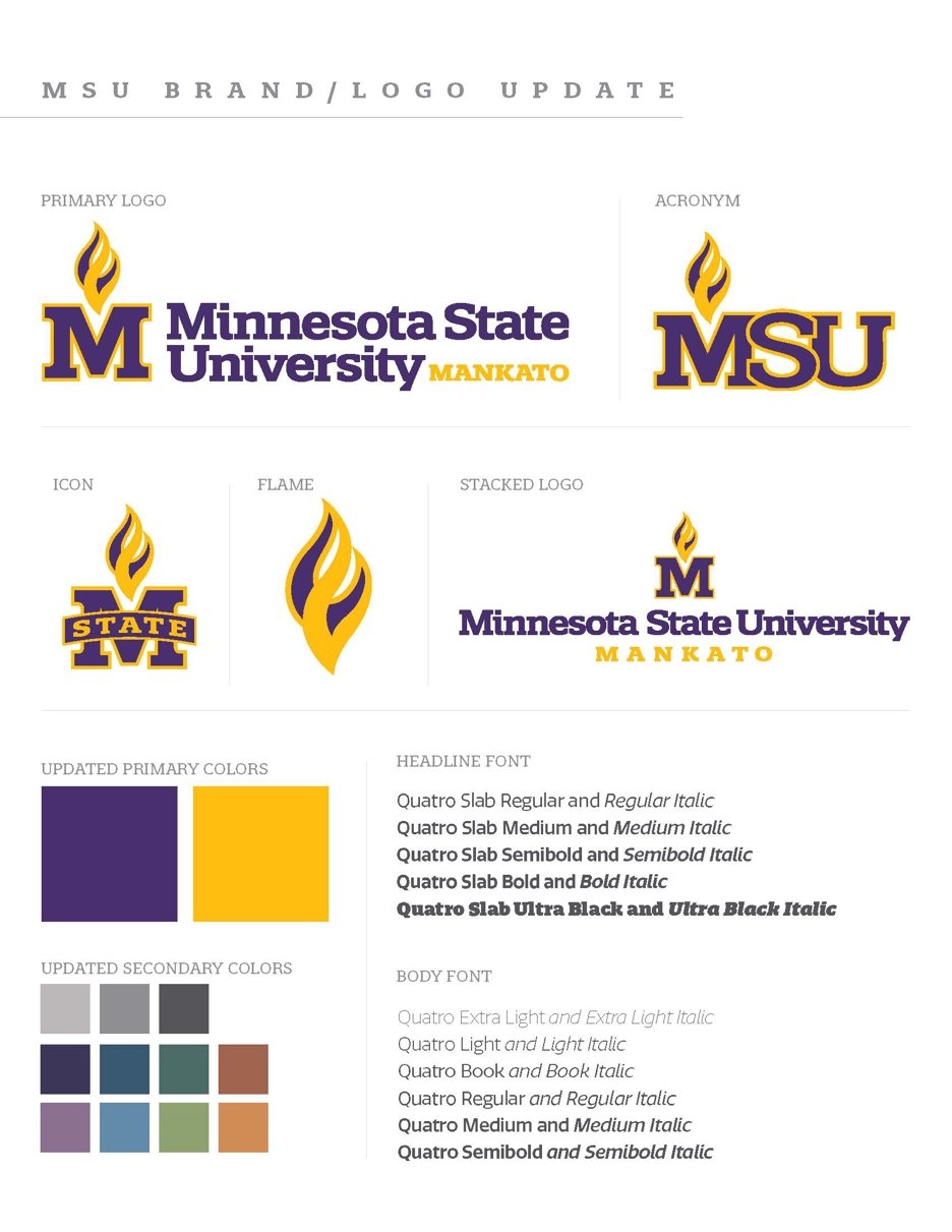
The new Maverick Purple and Maverick Gold are warmer and richer versions of the University’s traditional primary colors. The new formulas allow for more consistent use across print, digital and product applications.
An updated palette of secondary colors complements the primary colors. Secondary colors should be used in conjunction with the primary colors; they cannot be used on their own in publications or other materials.
University Brand Fonts
Using brand fonts helps maintain a consistent and recognizable visual identity, ensuring that all communication align with the brand’s personality and message. Consistent use of the University’s fonts contributes to brand cohesion, fosters a sense of professionalism and triggers brand recall across diverse platforms and marketing channels.
- Quatro is the brand font, which is an Adobe font and can be used through the Adobe suite.
- Kanit, a free Google font, is also an approved alternative.
using the new brand elements
- University Marketing and Communications is managing the use of all brand elements during the roll out process.
- To implement the new brand in publications, collateral materials or promotional products, please work with Creative Production by submitting a workorder through the online order form.
Questions can be sent to brand@mnsu.edu.